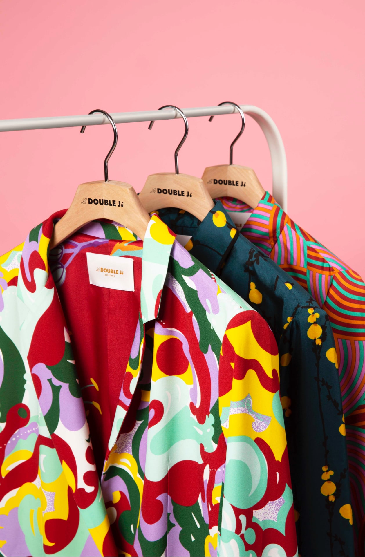
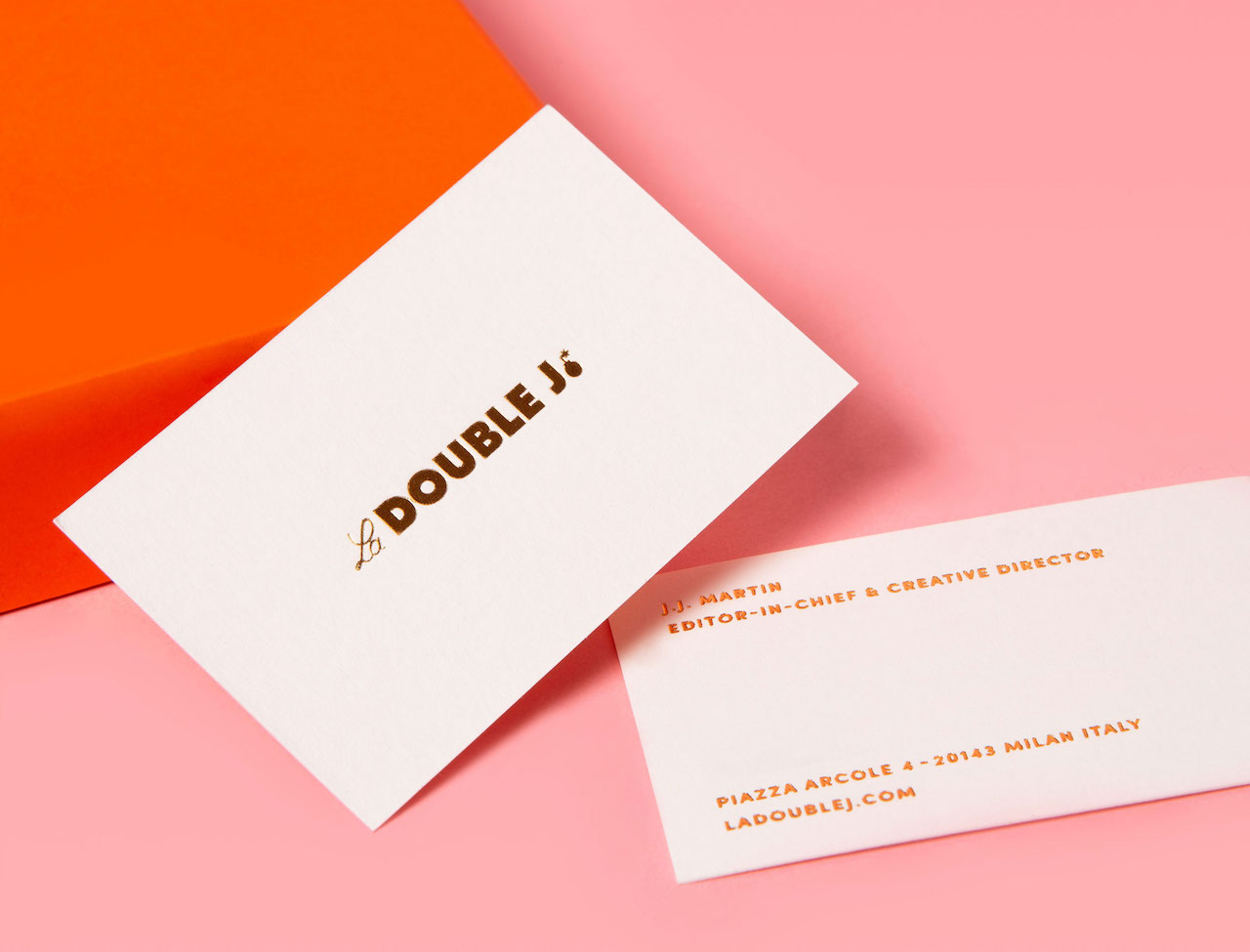
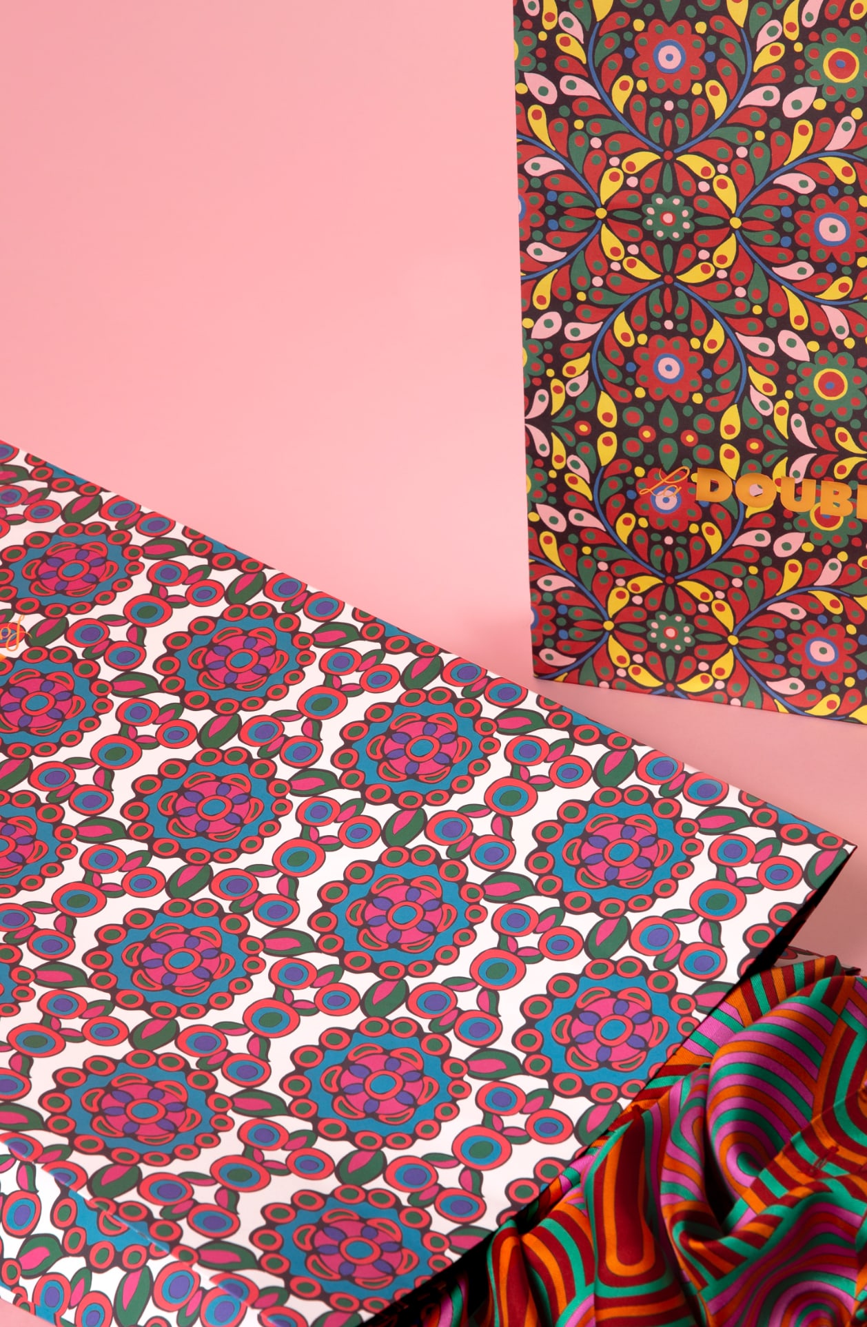
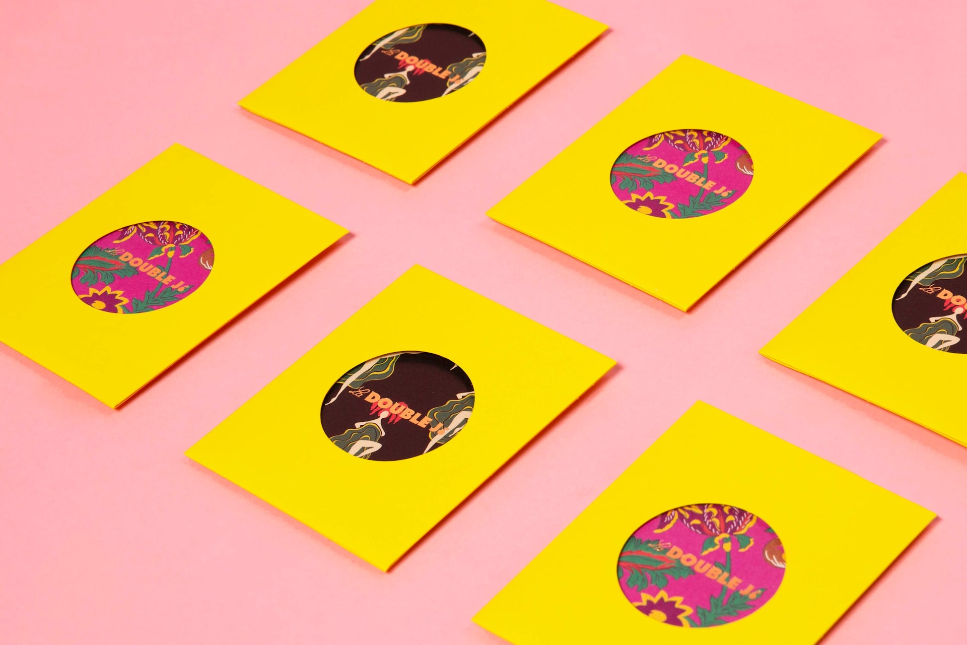
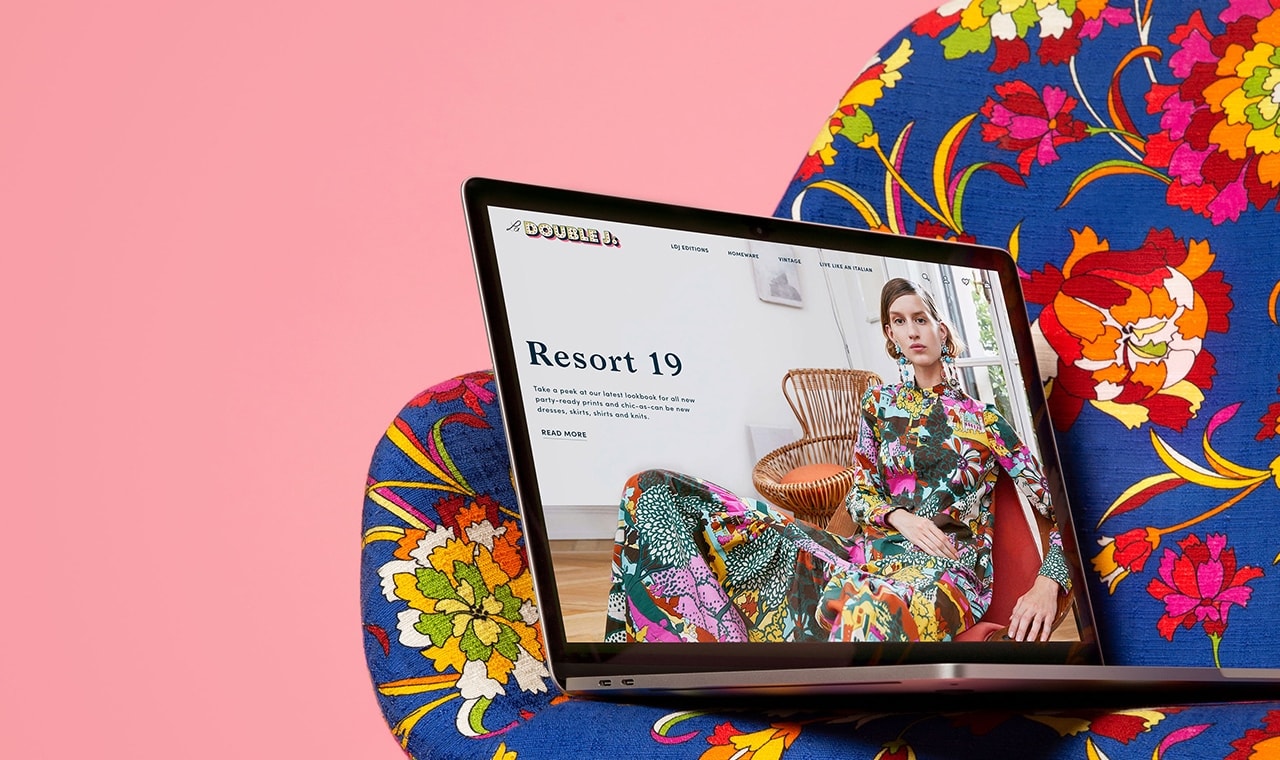
She wanted bold, she wanted luxury, she wanted fun. She also wanted to give the idea of her life: of an American woman living in Italy. Once this was all included in the >digital world, we developed the rest of the materials to complete the brand identity. We highlighted things that could only be seen online such as the animated logo and dynamic collages. We then proceeded to give the same look to the printed, off-line side of the brand. Combinations of strong colors, for example, give a special touch to the packaging and business cards.
La DoubleJ
Creating a brand with a bang
- Branding
client
La Double Joutput
Logo and Brand Identitycreative fields
Branding, CommunicationsWhen J.J. Martin looked to Frank Studio, her main idea was to create the brand identity for a shoppable magazine selling vintage clothes and accessories.

Then La DoubleJ evolved. The editorial side, the main one in the past, still lives as the Live Like an Italian section, dedicated to inspiring women and locations in the country, but gave space for more commercial themes. First came the apparel collections, totally new in design, but using archival prints. Then the homeware. And finally, also palpable works, such as a pop-up store and a guide developed for the Milan Fashion Week.
