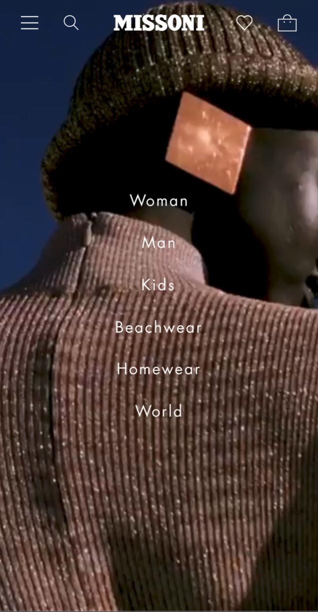
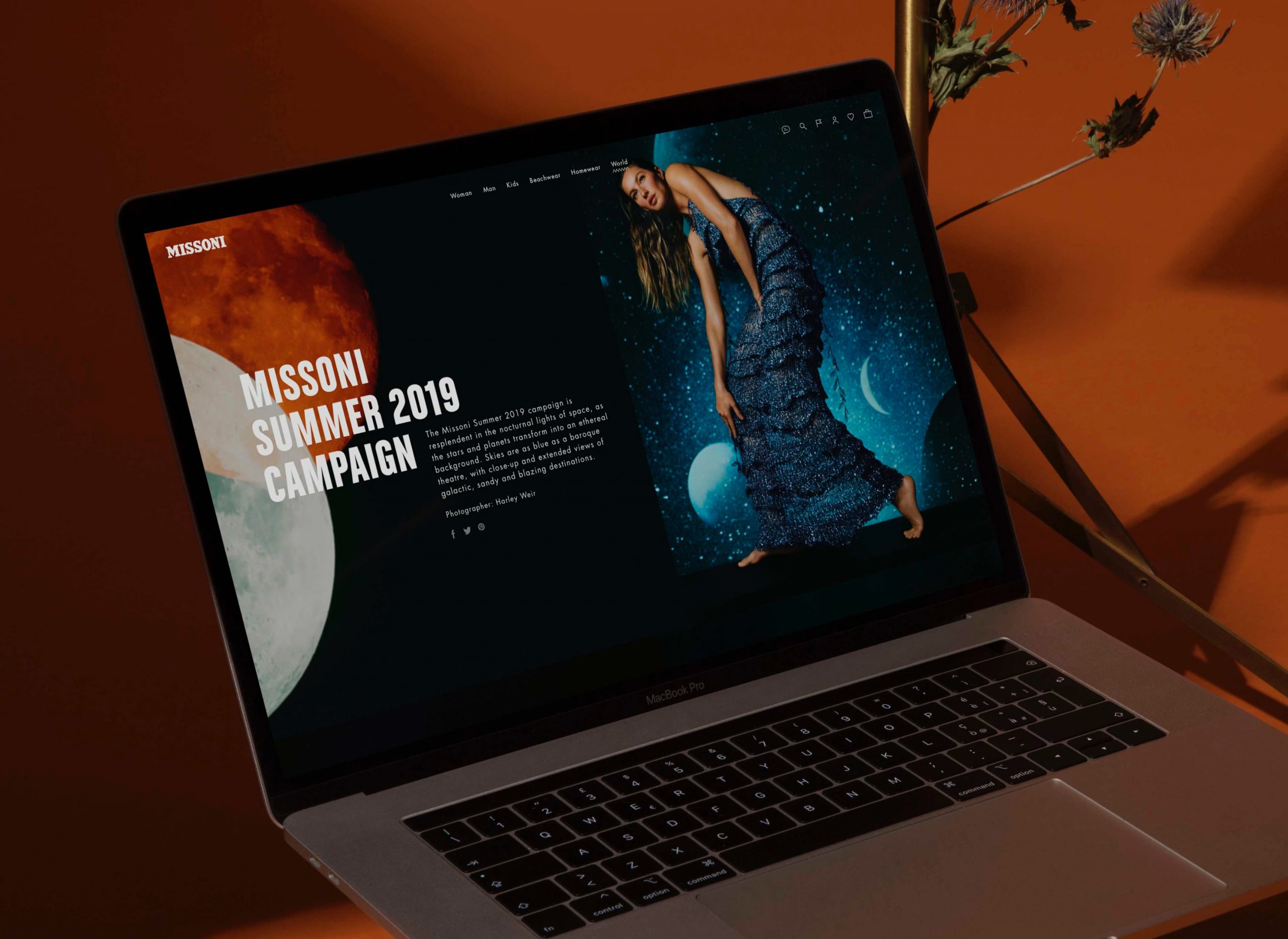
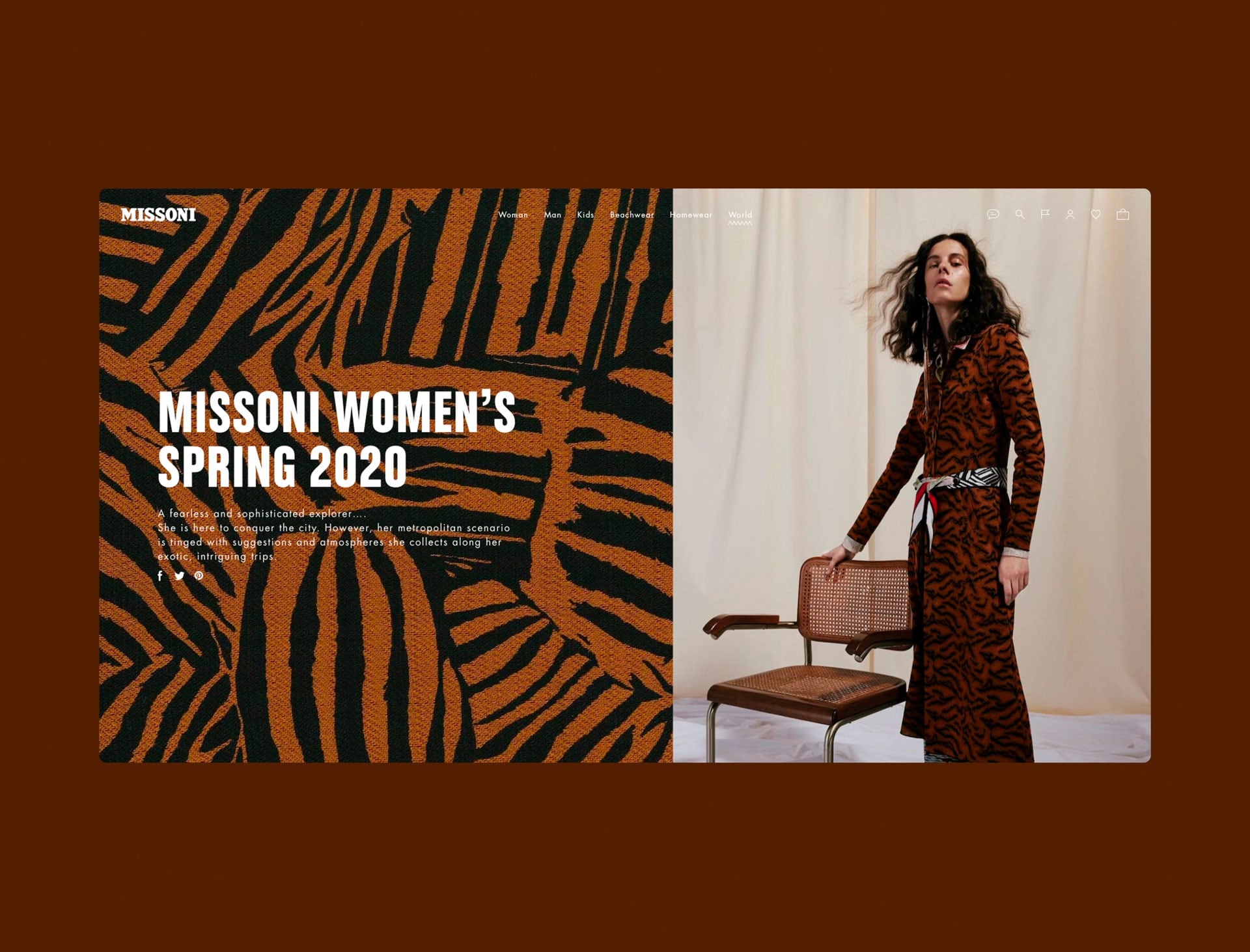
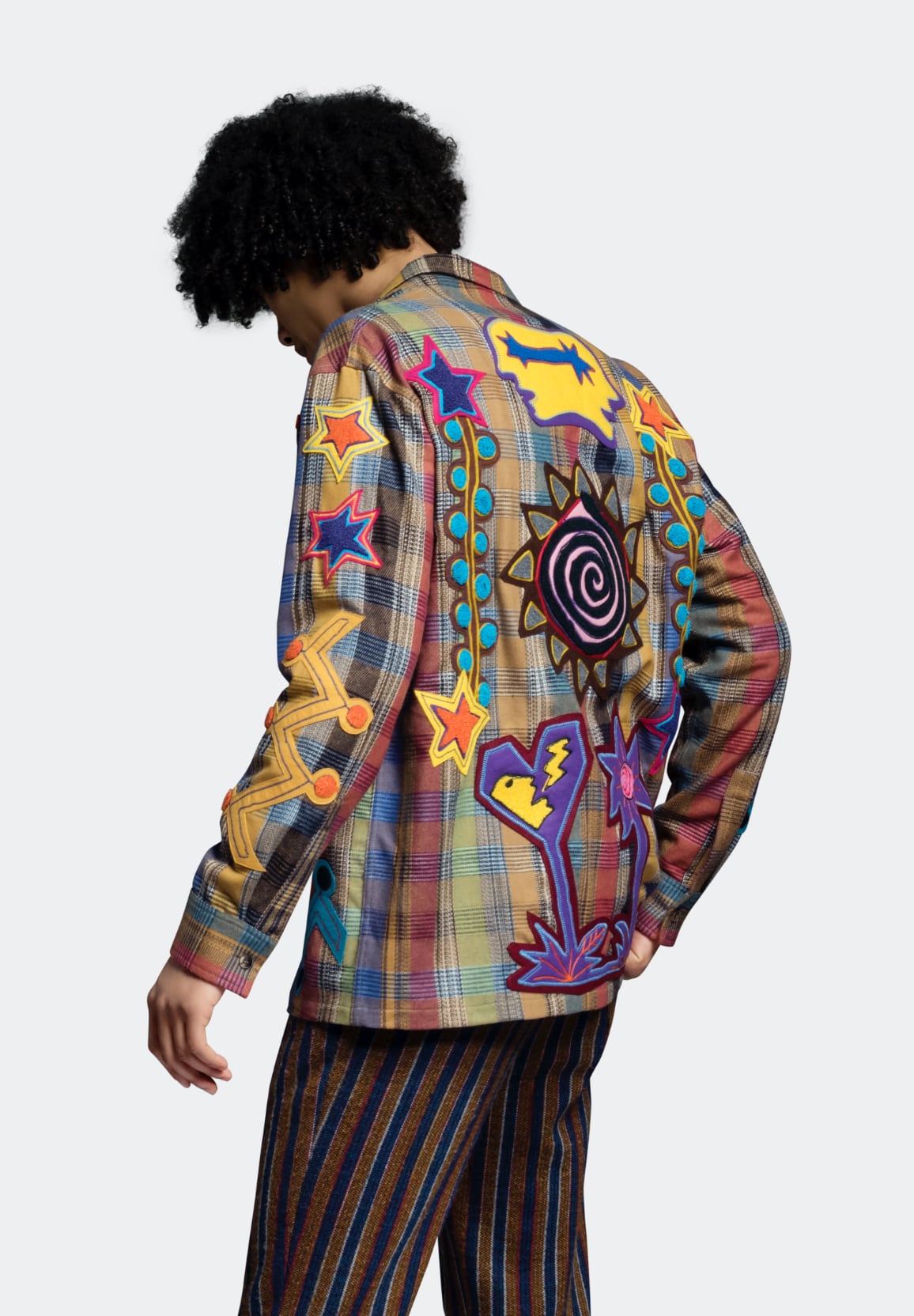
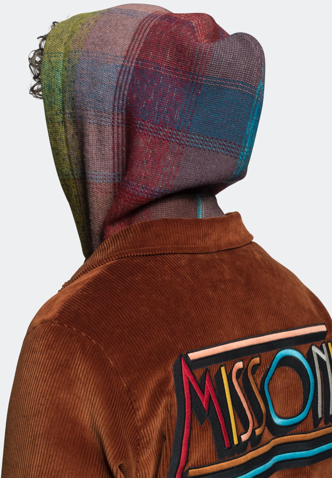
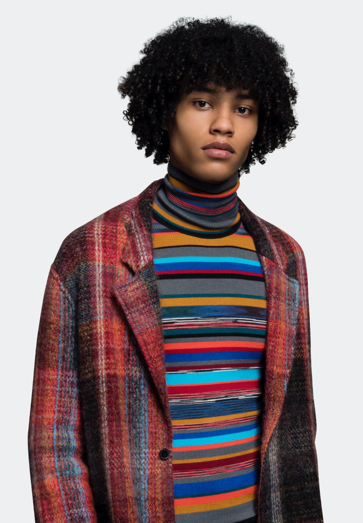
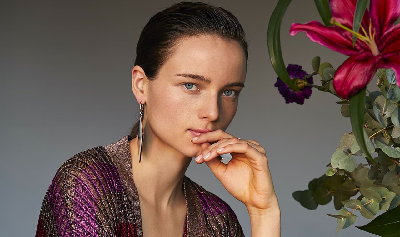
Missoni’s campaigns are always impactful so we decided to start from this already existing material and to dedicate it the pride of place that it deserves. Thanks to full screen banners on the homepage, the customer is immediately drawn into the brand’s atmosphere. The menu was strategically positioned in the middle of the main image, with a zig-zag underline appearing at mouse over that helps the customer get oriented. Categories pages were designed to have a mix of editorial and e-commerce shots, creating a perfect balance between the inspirational and the commercial. Frank Studio also created the e-commerce photography guidelines stearing the brand towards a more efficient way of displaying the products.
And then we arrived at Missoni’s World. A microsite that we designed and developed to reunite the newest aspects with the heritage of the brand. The content was not necessarily related to fashion, but reflected 100% this beautiful and traditional… World! A digital archive accessible to everyone.


