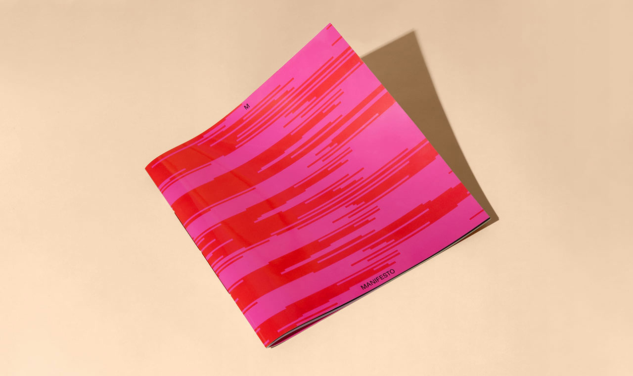
We used art direction to make Icon Design more appealing to anyone interested in the subject. A colorful magazine, bursting with creativity, without pushing the look & feel into the tastes of a niche market. We focused a bit less on the exciting but distant design and artistic worlds, a bit more on houses and a realistic point of view.
Previously the English texts were all included at the end of the magazine but here they were included in the main layout making it more international and inclusive for foreign readers. The cover, of course, underwent a big makeover too – instead of highlighting a professional or practical aspect, it now gives space to a beautiful inspirational image.


