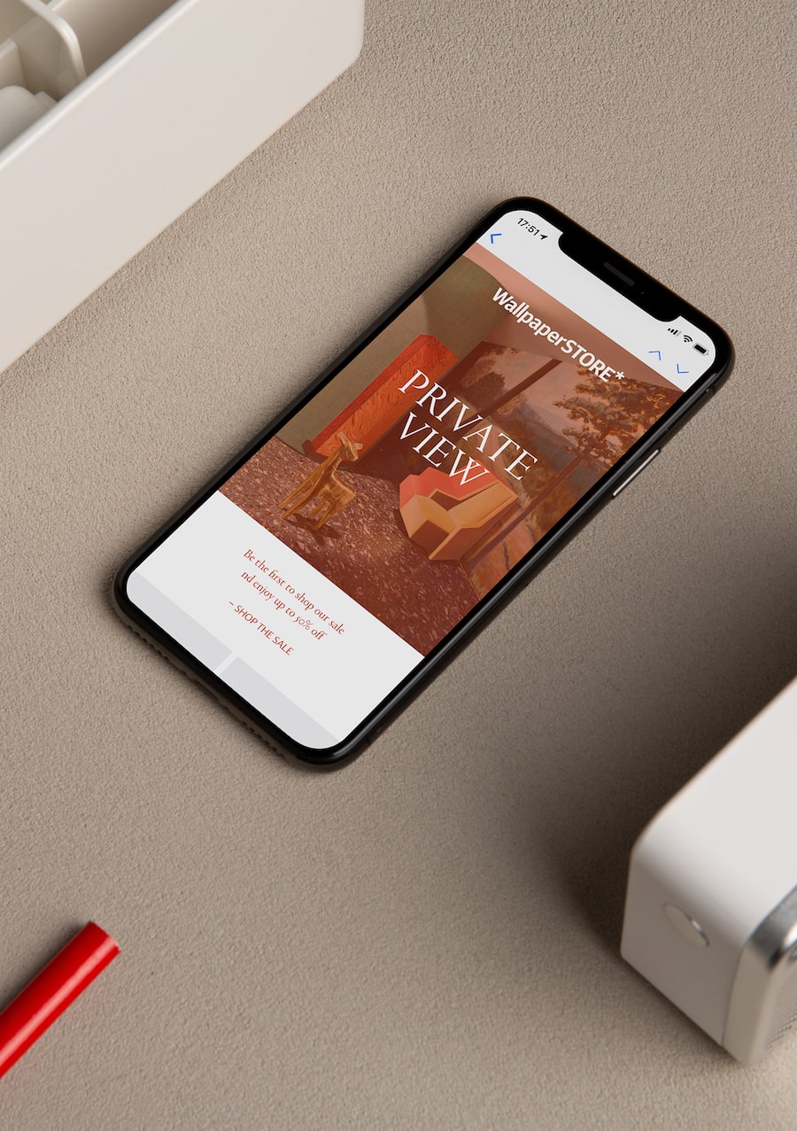
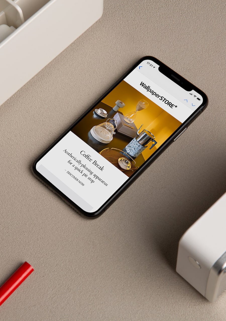
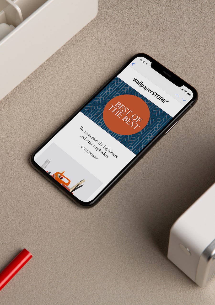
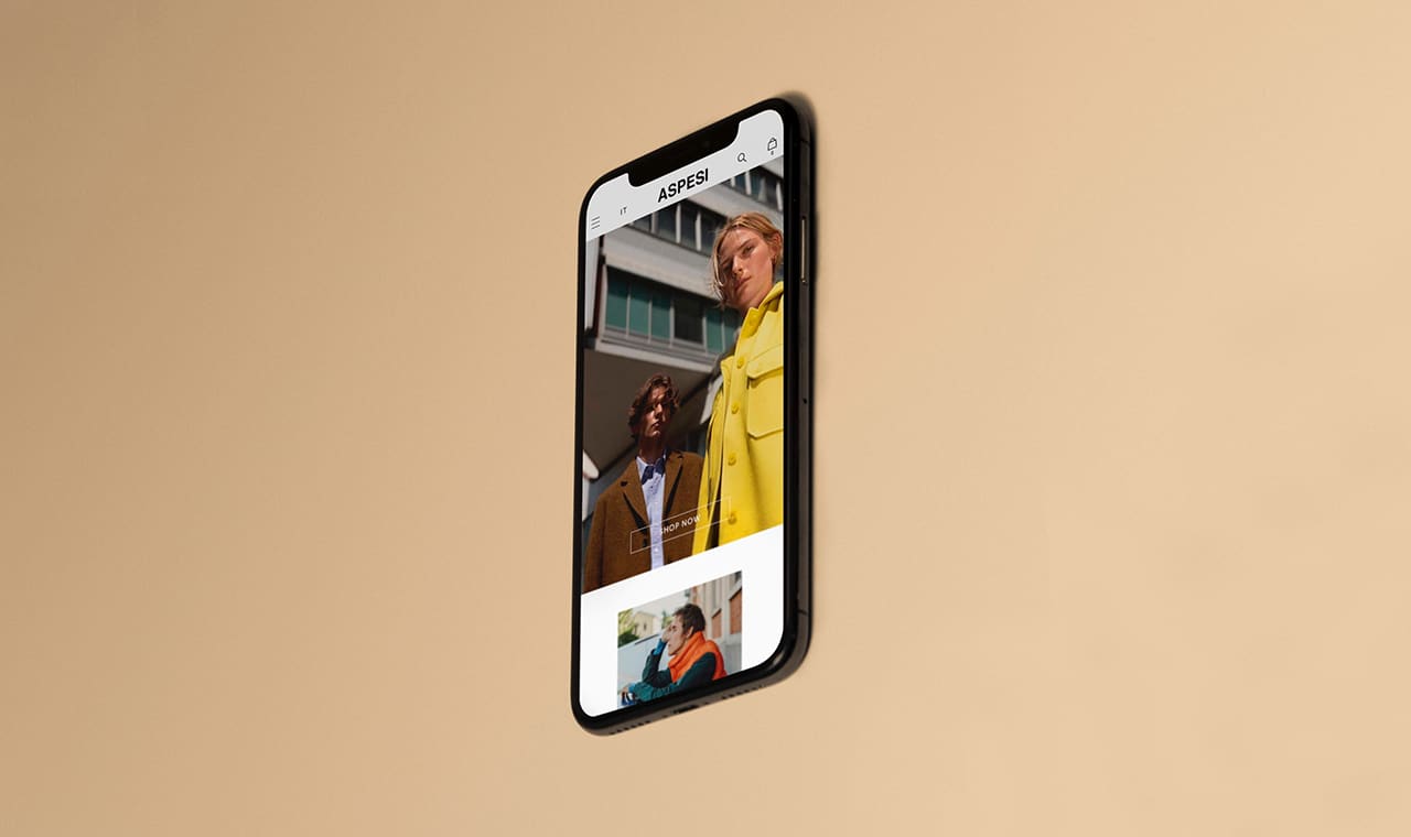
It had to be minimal and follow the same color palette. It had to be simple but functional. Working closely with the Wallpaper* team, Frank Studio developed the design of the website, suggesting simple solutions like the minimal icons substituting text links, like wishlist or search.
For the UX&UI side, we developed a series of best practices to provide the customer with an easy navigation system and WallpaperSTORE* with a focus on selling. The menu, for example, with filters that appear on mouseover no matter which page the user is in, serves as a constant way to explore new categories. The product page itself enriches the product through photography and text, creating a feeling of desire.
Taking this sensation even further, Frank Studio also created and developed the latest gift guide for the website. Thanks to special filters inspired by different personalities, “Find the Perfect Gift” focused on helping customers make the best choice even if they don’t really know the person they are buying a gift for.


